
Motion Design Case Study: "Neon Bubblegum…It's Refreshing!"
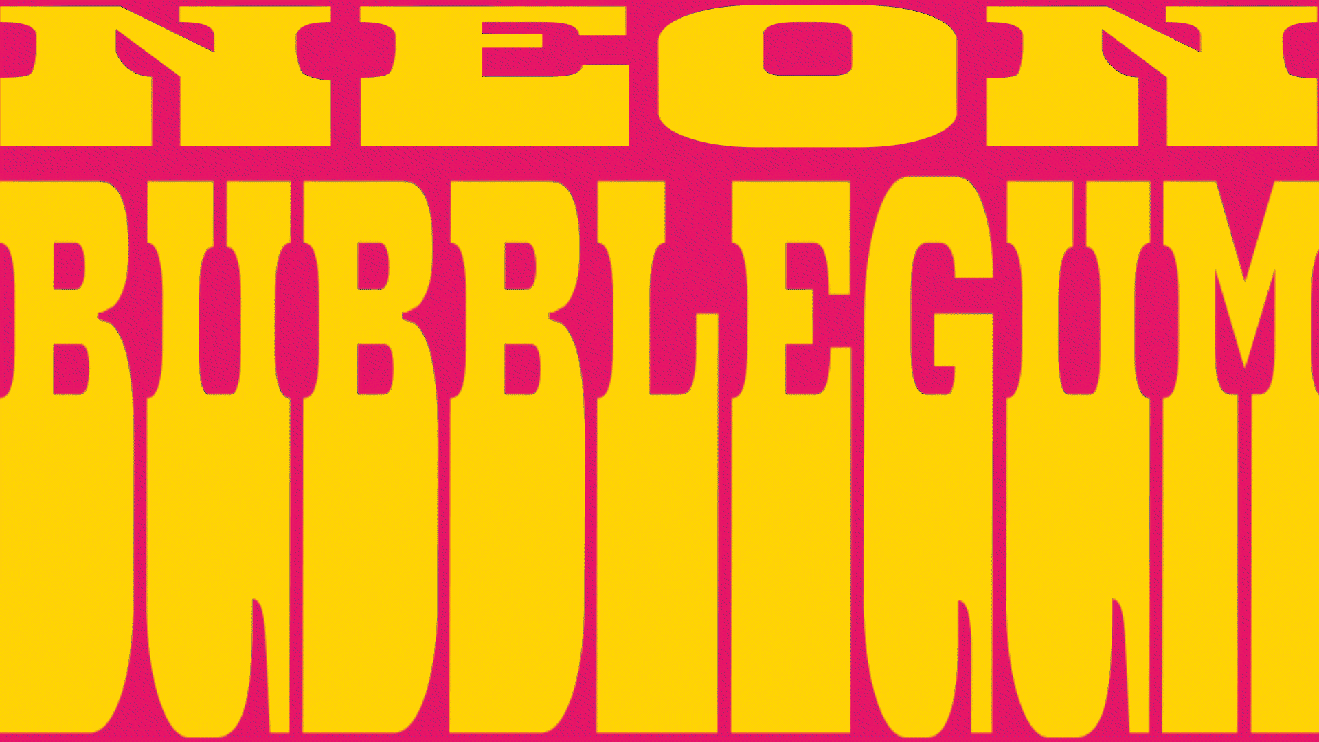
Creating the 30 second commercial, “Neon Bubblegum…It’s Refreshing” for an upcoming EP, was an opportunity to experiment with motion design and animation in a bitesize format. The can of Neon Bubblegum brand soda/energy drink is a visual representation of one of my on-going sound projects, Neon Bubblegum. I wanted to create a frenzied, fast-paced, slightly obnoxious advertisement that would fit right in with (and lampoon) soda commercials in general. The overall look and feel of the commercial was a combination of retro and modern approaches, from the color choices to the type faces, to the character design of the brand mascot.
At the start, I produced a series quick thumbnail sketches that I would use as the storyboard and as the initial timing for the edits. The music in the commercial is pulled from the upcoming sound project, and, from from the begining, I knew what section I would use as the background music. This particular section of the track, Zeitgeist 77, was timed with various shots to emphasize the overall pacing of the commercial. The initial rough cut was over the 30 seconds, so as I built out the commercial I would need to trim certain shots to work within my self-imposed time limit and to sync with certain parts of the music track.
One of the first pieces of production art I created was a 3D version of the Neon Bubblegum can. The image of the Electro-Kid on the front of the can was derived from an earlier collage called, “Saturday Mourning”. In the collage the Electro-Kid appeared as a sort of mascot for a brand of cereal called, “Sugar! Sugar Coated Sugar Cereal”. The version of the Electro-Kid that appears on the Neon Bubblegum soda can is a bit of an update to the character design, but otherwise embodies the overly caffeinated character I had originally envisioned.
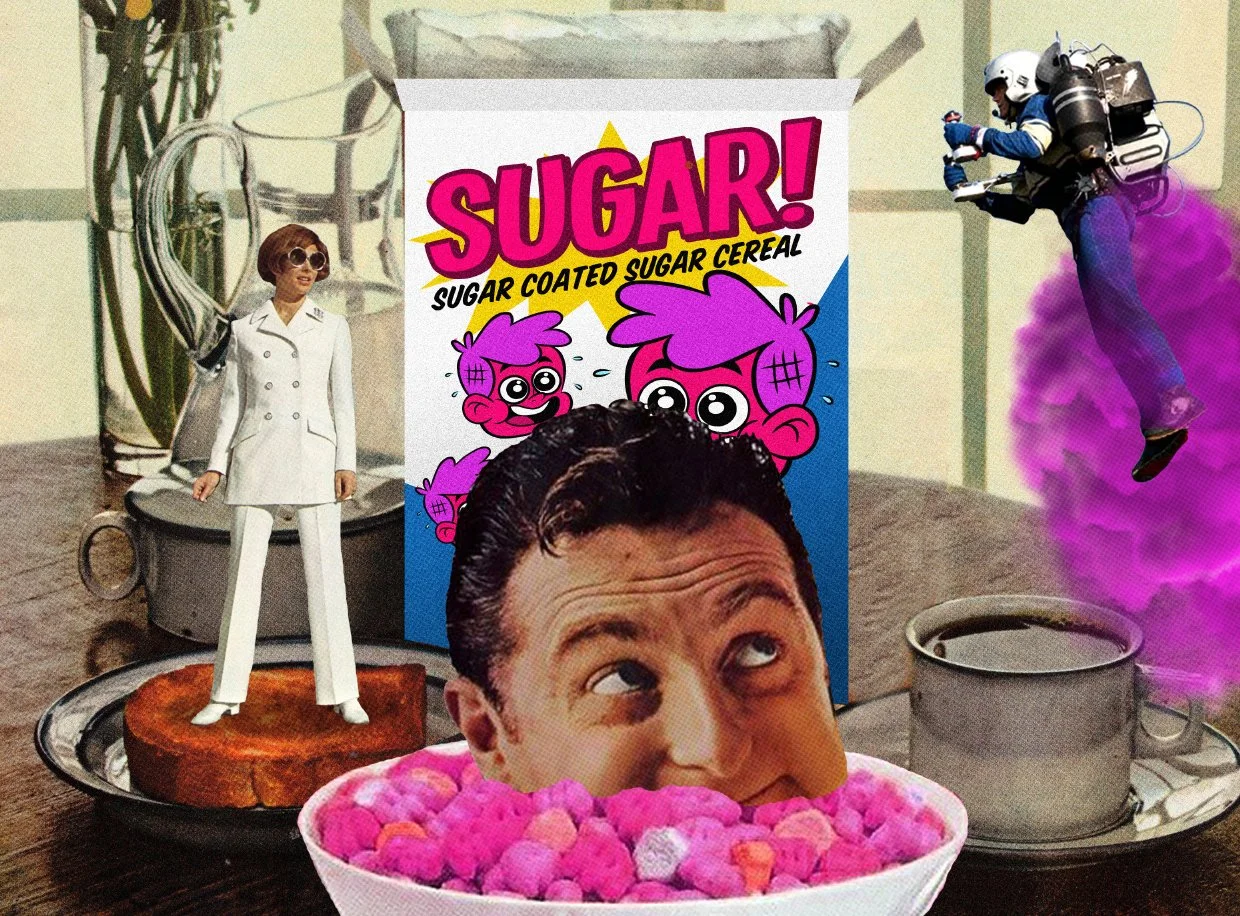

“The version of the Electro-Kid that appears on the Neon Bubblegum soda can is a bit of an update to the character design, but otherwise embodies the overly caffeinated character I had originally envisioned.”
I wanted to create both 2D and 3D animation for the commercial, so I leveraged Adobe After Effects for the 3D animation, editing and post production and Adobe Animate to create the 2D animated sections. I animated the 3D sections first then then the 2D bits, replacing static placeholder images as I went.


I used After Affects’ FX tools to create a range of psychedelic visual treatments of the soda can. The soda can and the character of the Electro-Kid are the main elements of the commercial, and as such, I animated both in various degrees of distortion and flux.
Another hallmark of soda commercials are the quick cuts. Jump cuts, fast camera zooms, slow motion that is then sped up, are all utilized to keep the momentum of the ad going until the end.
All of these visuals are paired with simple, bold and lurid color backgrounds that are used to highlight the frantic nature of the foreground animations. Animated type is also utilized to reinforce the name of the brand. When the last shot of the commercial finally arrives, the text that slides onto the screen—“It’s Refreshing”—is quickly replaced by other adjectives that are less welcoming and more descriptive of the possible offensive nature of the drink itself.


“When the last shot of the commercial finally arrives, the text that slides onto the screen— “It’s Refreshing”—is quickly replaced by other adjectives that are less welcoming and more descriptive of the possible offensive nature of the drink itself.”
The final 30 second commercial went through a round of color grading in post, as well as lighting fixes before it was ready to be shot out into the wilds of the internet.